In preparation for the new 2025/26 Eredivisie season, all 18 clubs are once again unveiling their new kits — a proud tradition each year. Curious to see the home and away shirts for every team? Check out the full overview below.
Ajax
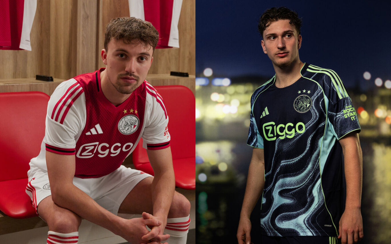
Ajax home kit 2025/26
Ajax have unveiled their new home kit for the 2025/26 season. As always, the design features the club’s iconic white-red-white colour scheme and proudly brings back the classic Ajax logo on the chest. The shirt pays tribute to 750 years of Amsterdam. Inside the collar, a banner displays the city’s founding year (1275), the anniversary year (2025), and the three Saint Andrew’s crosses. The red central stripe includes a subtle graphic pattern made up of crosses in two shades of red.
Black accents are used throughout the design — a nod to the Amsterdam city flag, which also features prominently in the mainly black training collection.
Ajax away kit 2025/26
Just like the home shirt, Ajax’s new away kit also subtly references Amsterdam’s 750th anniversary. The design centres around the city’s connection to water, with a striking blue colour palette symbolising Amsterdam’s canals and waterways. The water theme also serves as a tribute to Ajax’s world-renowned youth academy. When asked how Ajax continues to produce so many talented players, the answer is sometimes jokingly: “It must be in the water.”
AZ
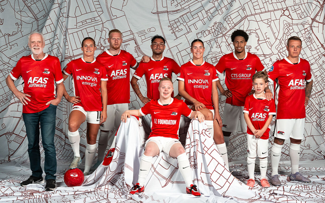
AZ home kit 2025/26
From the canals of Alkmaar to the banks of the Zaan. Through the Zaanse Schans and onto the Waagplein. This is more than just a shirt: this is what unites us. A tribute to our heritage, with the region that raised us proudly at its core. Growing up in the Zaanstreek, making your debut in Alkmaar - it’s the dream we all share. Whether you’ve been a fan since ’67 or only just welcomed AZ into your heart, Whether you cheer from the stands or support from home. Wearing this shirt means being part of something bigger. Part of the AZ family: generations, cities, fans and players. Proud of our past, ready for the future.
AZ away kit 2025/26
To be announced.
Excelsior Rotterdam
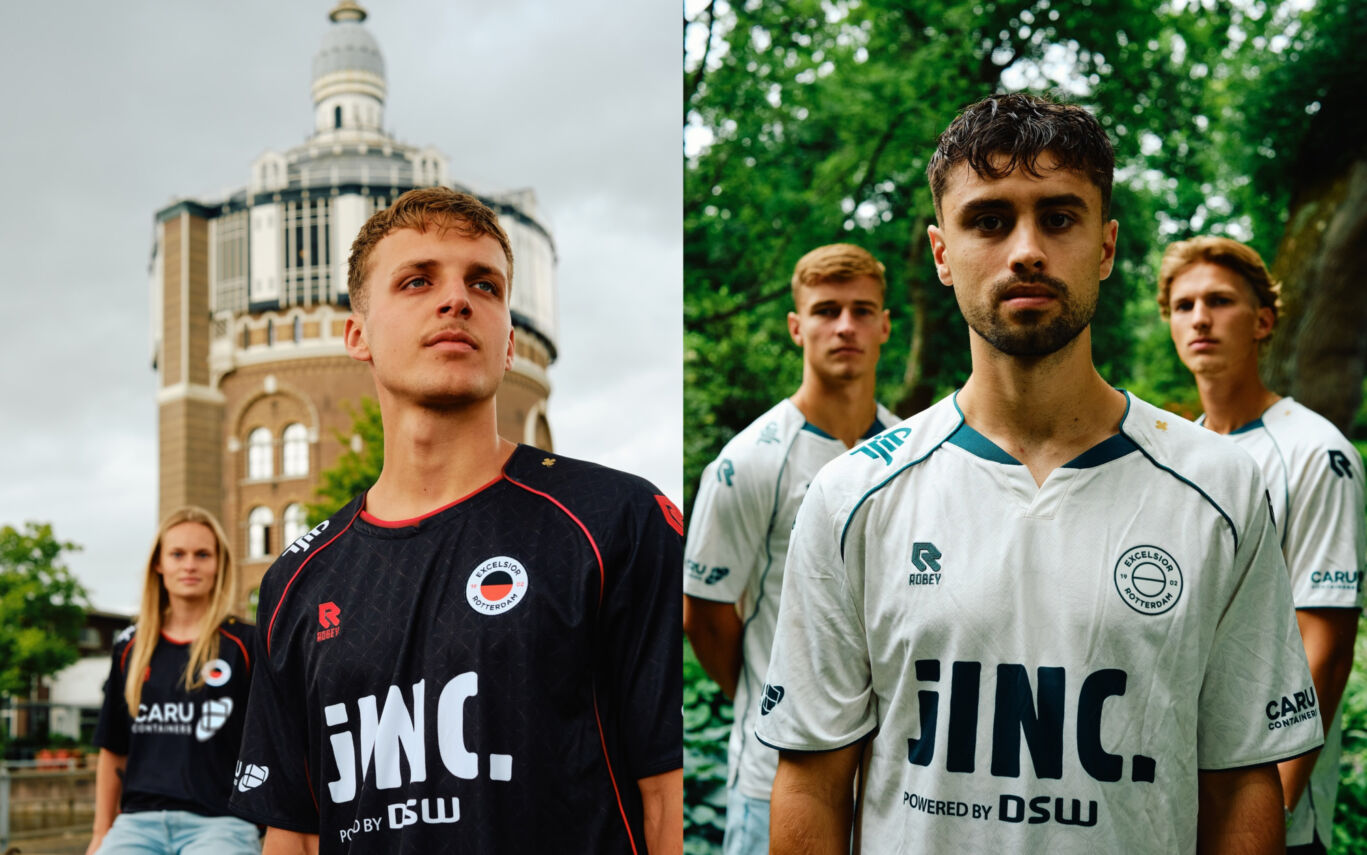
Excelsior Rotterdam home kit 2025/26
The new Excelsior home shirt is here. Born in Kralingen. Made for everyone who lives and breathes black and red. For the upcoming season, we went into the neighbourhood. Not just anywhere, but to the places that define Kralingen. Familiar ground for our fans, players, and locals. From the lake to the streets, from cafés to history, from the pitch to the city skyline; these places gave the shirt its soul. This isn’t just another design. It’s a story that says: “This is where I’m from. This is my club.”
Excelsior Rotterdam away kit 2025/26
Excelsior’s new away kit is more than just a jersey. It’s a tribute to stillness in the heart of the city - to hidden beauty. To Kralingen in bloom. Where the stadium meets the green, you’ll find Trompenburg: the botanical garden of Kralingen, and Rotterdam’s living museum of colour and calm. That’s where we found our inspiration. No bold prints: just a subtle reflection of this peaceful place. A reminder of where Excelsior belongs. This kit is made for moments far from home — but it feels like coming home. Whether you're playing on foreign soil or standing on the sidelines, you’re wearing more than just colours. You’re wearing a story. A piece of Kralingen that travels wherever Excelsior goes.
FC Groningen
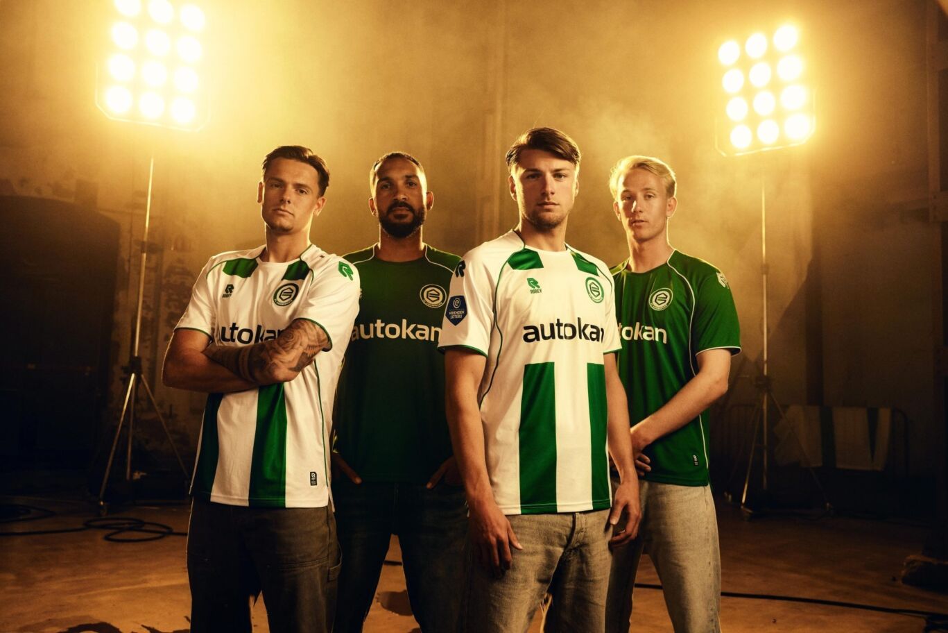
FC Groningen home kit 2025/26
The 2025/26 kits honour the club’s rich history. FC Groningen’s roots lie in the Oosterpark, a place the club will forever cherish. Exactly 20 years after the move to Euroborg, the Oosterpark theme has been woven into the design. Because a true Groninger never forgets where they come from. The home shirt echoes the style worn in the club’s final seasons at Oosterpark in the early 2000s, featuring shortened green vertical stripes, reminiscent of the shirts worn on the famous Zaagmuldersweg.
FC Groningen away kit 2025/26
The away shirt features the same deep green used in the early 2000s. The iconic Oosterpark fencing is subtly embedded into the fabric’s pattern, bringing a piece of history back to life. Inside the collar, you’ll find green-and-white stripes - mirroring the inside design of the old stadium’s short-side stands - along with the years 1933–2005, the period in which GVAV and FC Groningen played at Oosterpark. These dates also appeared on a massive banner displayed by supporters during the club’s final league match at Oosterpark against N.E.C.
FC Twente
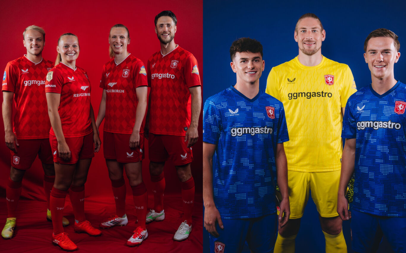
FC Twente home kit 2025/26
The new FC Twente home kit is inspired by the memorable 2010/11 shirt, the season in which the club made its debut in the Champions League group stage — wearing a bold diamond pattern. The 2025/26 version builds on that legacy, blending in meaningful symbols of the club, city, and region - including the coat of arms of Enschede and the iconic Twente Horse. The club’s founding year, 1965, is featured inside the collar and on the socks. The deep red shade from the club crest is used on the sleeves and shorts, giving extra contrast to the patterned body. A subtle vertical transition through the shirt adds a sense of movement and power. The Twente Horse also appears in the shirt numbers.
FC Twente away kit 2025/26
The new away kit features a graphic design inspired by the iconic brick walls of Het Diekman Stadion — a dotted pattern that also appears in the shirt numbers. Just like the home shirt, the club’s founding year, 1965, is printed inside the collar and on the socks - ensuring that players wear a visible piece of Enschede’s football heritage. With its sharp design and historical detail, this is a kit that feels powerful, innovative, and full of energy.
FC Utrecht
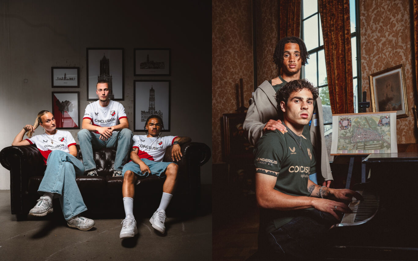
FC Utrecht home kit 2025/26
A classic red-and-white design, powered by a bold diagonal featuring Utrecht’s most iconic landmark: the Dom Tower. A shirt that stands tall: strong, proud, and instantly recognisable. Created by the city, for the city.
FC Utrecht away kit 2025/26
A unique design inspired by a historic map of Utrecht, with the city’s iconic canal ring, the singel, at its heart. The pattern subtly weaves in the winding shapes of Utrecht’s canals, reflecting the rhythm of the city. A shirt that breathes Utrecht: a tribute to the streets and waterways that connect us all.
FC Volendam
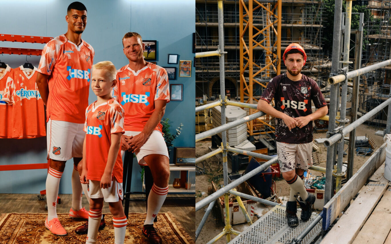
FC Volendam home kit 25/26
For the 2025/26 season, FC Volendam takes it back to the glory days of the 1990s. Inspired by the iconic “Veronica shirt”, this year’s home kit brings back the trusted Volendam orange, paired with the white details seen in the kits from that successful era. Worn with pride during the club’s sixth-place finish in the 1991/1992 season, the kit also features a special touch: the old FC Volendam crest will appear on the chest for this season only. The shorts and socks are white with orange accents, while the blue details around the HSB sponsor logo echo the blue elements from the original shirt.
FC Volendam away kit 2025/26
FC Volendam’s new away kit is a tribute to the construction trade, an industry that runs deep in the DNA of the town. Every morning, construction vans leave Volendam to building sites all over the Netherlands, many of them bearing the name of main sponsor HSB. This season, Volendam will hit the road in an anthracite grey kit, featuring cement-coloured accents on both the shirt and shorts. The shirt includes subtle orange details, and the club crest is given a cement-textured look: a nod to the working hands that help build both homes and dreams.
Feyenoord
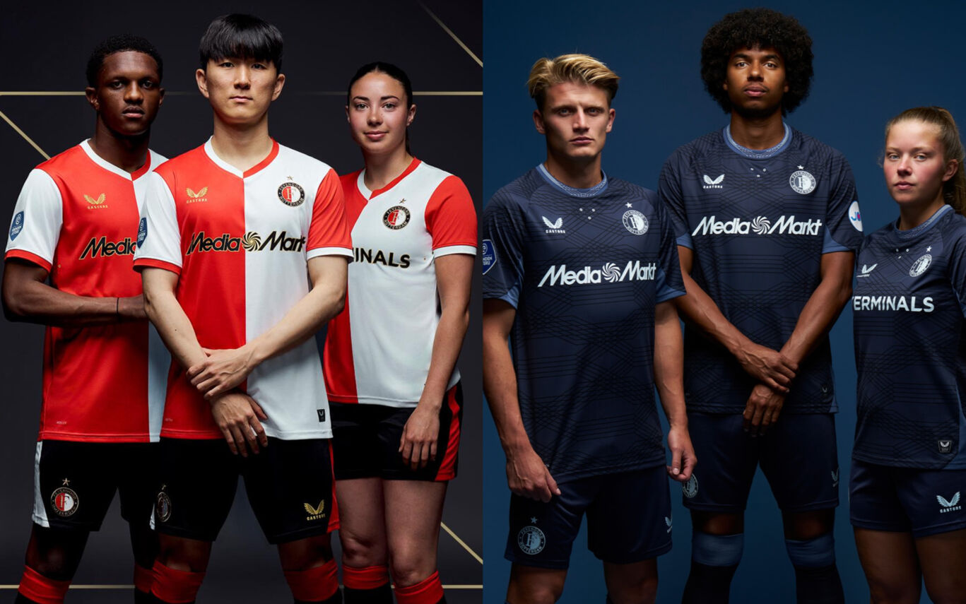
Feyenoord home kit 2025/26
For the first time, Feyenoord’s updated crest, introduced last summer, proudly appears on the chest of the club’s iconic red-and-white shirt. The 2025/26 home kit pays tribute to Feyenoord’s rich history with its unmistakable colour scheme, while adding a modern twist through gold accents featured in the Castore logo and the outlines of the sponsor print and squad numbers. The look is completed by black shorts and socks, detailed with red-and-white trim, reinforcing the powerful identity worn with pride by generations.
Feyenoord away kit 2025/26
Feyenoord’s new away kit stands out with its bold, robust look and graphic design. Dark tones are contrasted by subtle light blue accents, which appear not only in the pattern but also in the collar: giving the shirt a dynamic and characterful feel. The look is completed with dark grey shorts, light blue detailing, and matching socks. Special attention was once again given to the back of the shirt: the names and numbers are printed in Feyenoord’s signature font, featuring a subtle embossed pattern for added texture and identity.
Fortuna Sittard
Fortuna Sittard home kit 2025/26
Once again this season, Fortuna Sittard has opted for a premium look. The shirt is crafted from high-quality polyester and features the club’s iconic yellow and green colours. The club crest sits proudly on the left chest, close to the heart, with concentric rings around it, emphasizing this symbolism and giving the front of the shirt a bold, focused appearance. Rubberised details add a touch of exclusivity and modern finish, while subtle green accents in the collar and sleeve cuffs complete the design. Circular lines throughout the shirt add depth and character. Inside the neck, you’ll once again find the words "Pioneers of Dutch Football", paired with the snakes from the coats of arms of surrounding municipalities: a subtle nod to Fortuna’s regional roots.
Fortuna Sittard away kit 2025/26
To be announced.

Go Ahead Eagles
Go Ahead Eagles home kit 2025/26
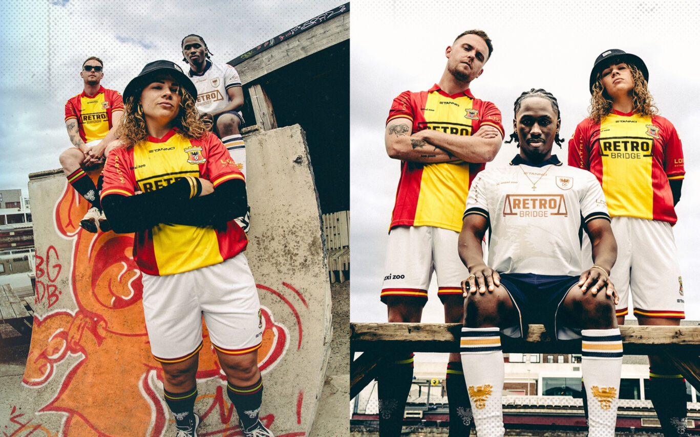
The 2025/26 home shirt once again features the club’s traditional red and yellow stripes, with a classic, retro-inspired design. It’s paired with white shorts and black socks, featuring the club crest and the name of our new main sponsor: Retro Bridge. The new kit will be worn for the first time during the pre-season campaign ahead of the 2025/26 season.
Go Ahead Eagles away kit 2025/26
This season’s away kit is predominantly white, with striking dark blue and gold details. A stylised eagle appears on the front of the shirt as a bold design feature. As in previous years, several loyal partners are once again featured on the shirt. The back includes dedicated space for Salland Zorgverzekeringen (Eagles' social partner) and Validsign. Matrix and LoooX remain on the sleeves for another season. The front continues to display Maxi Zoo, while new main sponsor Retro Bridge now holds a prominent position on the chest.
Heracles Almelo
Heracles Almelo home kit 2025/26
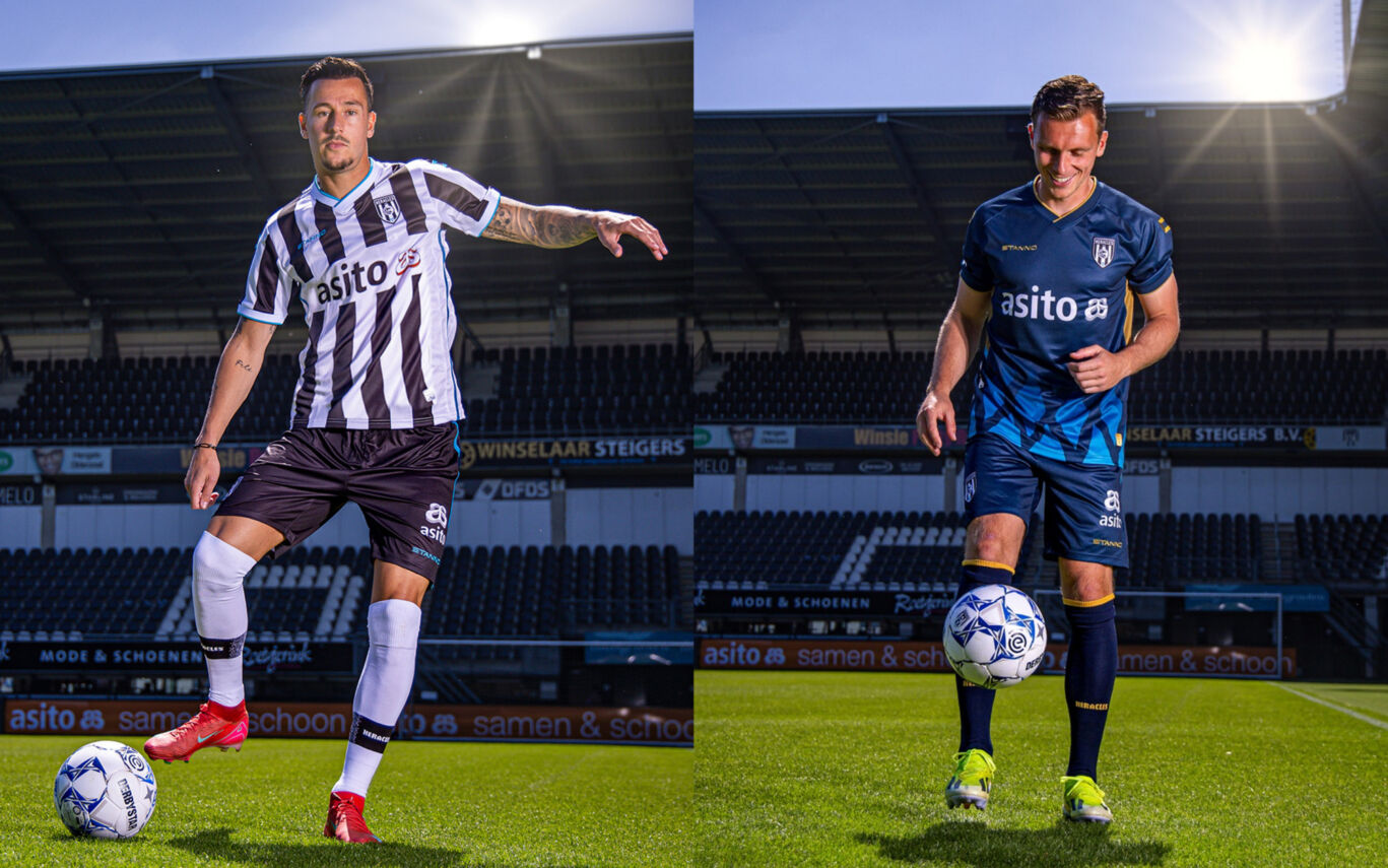
The new home shirt immediately stands out with its clean black-and-white look, complemented by fresh blue accents. It features a modern design, crafted from comfortable, high-quality materials by new kit partner Stanno.
Heracles Almelo away kit 2025/26
Just like the home kit, the new away shirt was designed in the club’s tradition and chosen by the fans. The shirt features a dark blue base with a gradient design that flows into a pattern of Almelo diamonds, coloured in signature Almelo blue. Gold accents throughout the kit add a sleek, modern finish. The full kit includes matching dark blue shorts and socks, both featuring gold detailing. This away kit is also the second shirt released as part of Heracles Almelo’s new partnership with Stanno, which began this season.
N.E.C. Nijmegen
N.E.C. Nijmegen Anniversary Kits 2025/26
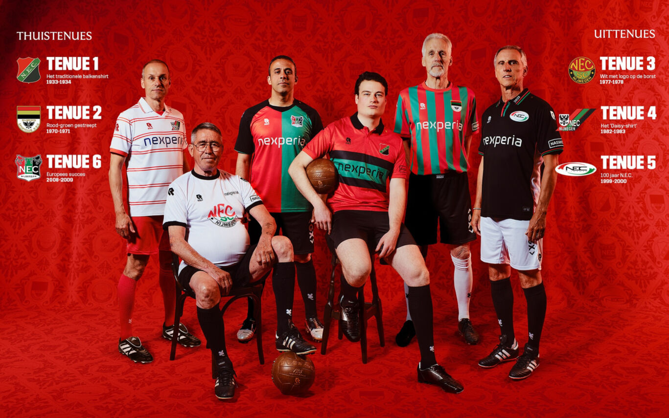
As the first professional football club in the Netherlands to do so, N.E.C. Nijmegen will compete in the upcoming Eredivisie season wearing six different match kits, each inspired by iconic shirts from the club’s past. Each kit also features a different historic club crest, representing the six logos used throughout N.E.C.’s history.
Rather than choosing a single anniversary crest, N.E.C. has decided to honour its rich heritage by bringing back all six historic logos, each tied to a specific era. Every supporter has a favourite shirt, crest, or period - and this collection is designed to celebrate them all.
Each N.E.C. crest tells the story of a chapter in the club’s timeline. From those eras, six standout kits were selected and reimagined as retro tributes, to be worn at De Goffert and away grounds across the country. Every design is a modern take on an original shirt from its respective era.
Throughout the season, N.E.C. will wear three different home kits and three away kits in Eredivisie and KNVB Cup matches.
- Home kits (1, 2, and 6) will be worn on rotation every six matches, with kit 6 used for five home games.
- Away kits (3, 4, and 5) will rotate based on the opponent’s colours, in coordination with the KNVB.
NAC Breda
NAC Breda home kit 2025/26
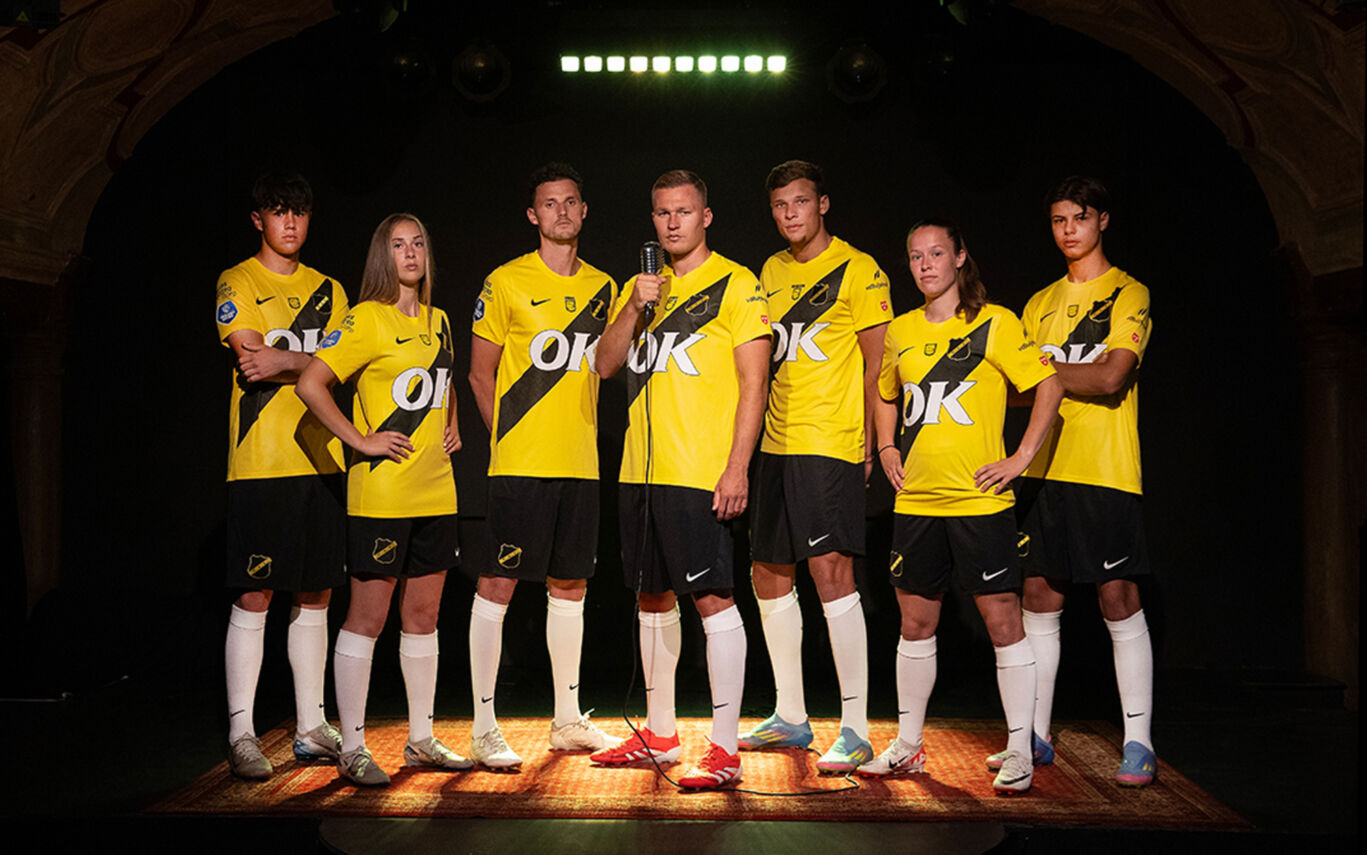
This season, NAC Breda kicks off a three-part kit trilogy, with each shirt bringing to life the club’s campaign: “No friction, no shine.” The first edition is inspired by jazz, a genre deeply rooted in the city of Breda. Without tension and experimentation, jazz would never have existed — and this shirt pays tribute to that very spirit. It's a thank-you to everyone who contributed to the creation of this musical first chapter. The shirt was designed by longtime NAC designer Myrthe Koppelaar of BRASH Brand Design Agency, with additional design input from Hugo de Graaf, who personally created one of the featured looks. As with previous seasons, the designs were developed in close collaboration with the NAC Shirt Committee.
NAC Breda away kit 2025/26
To be announced
PEC Zwolle
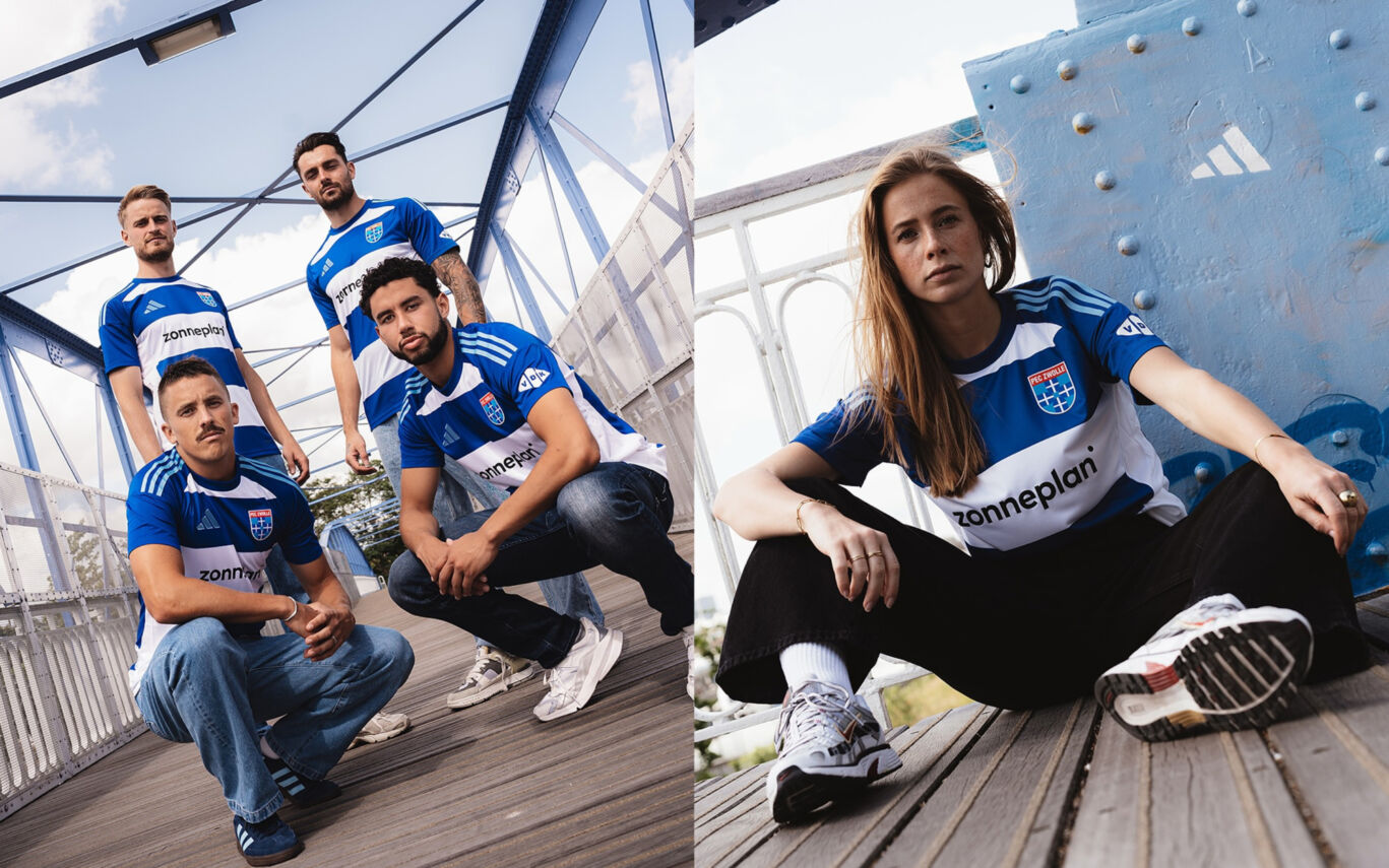
PEC Zwolle home kit 2025/26
Never before have the shades of blue from the PEC Zwolle crest been reflected so beautifully and boldly in a kit. The light blue from the logo is featured throughout the design in the iconic three adidas stripes, the adidas logo, and across the shorts and socks. The front of the shirt proudly displays the name of new main sponsor Zonneplan. VDK Groep appears on the lower back and sleeve, while X-ICT is featured on the shorts.
PEC Zwolle away kit 2025/26
To be announced.
PSV
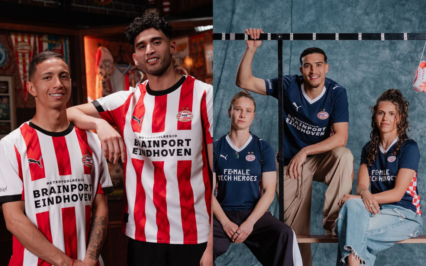
PSV home kit 2025/26
This shirt reflects who we are and what we feel. The new home kit is charged with the energy of that one decisive moment. The moment everything comes together: just before the goal, when the entire stadium holds its breath and the city is ready to erupt. That tension, that energy pulsing through every fibre, is captured in the iconic red stripes of the shirt. Black accents on the collar and sleeves give the design a modern and powerful edge. Combined with the classic red and white, it creates a stylish kit that isn’t just worn.. it’s felt.
PSV away kit 2025/26
A tribute to our roots and to our loyal supporters across every corner of Brabant. Because our fans are the beating heart of the region, we invited season ticket holders from every municipality in Brabant for a special experience ahead of PSV vs Fortuna Sittard. They were the first to see the new away shirt, revealed in a mystery box. Their pure, proud reactions are the heart of our campaign. As tradition dictates, PSV wore the new away kit during the final away match of the season; this time, the title-deciding clash against Sparta Rotterdam.
sc Heerenveen
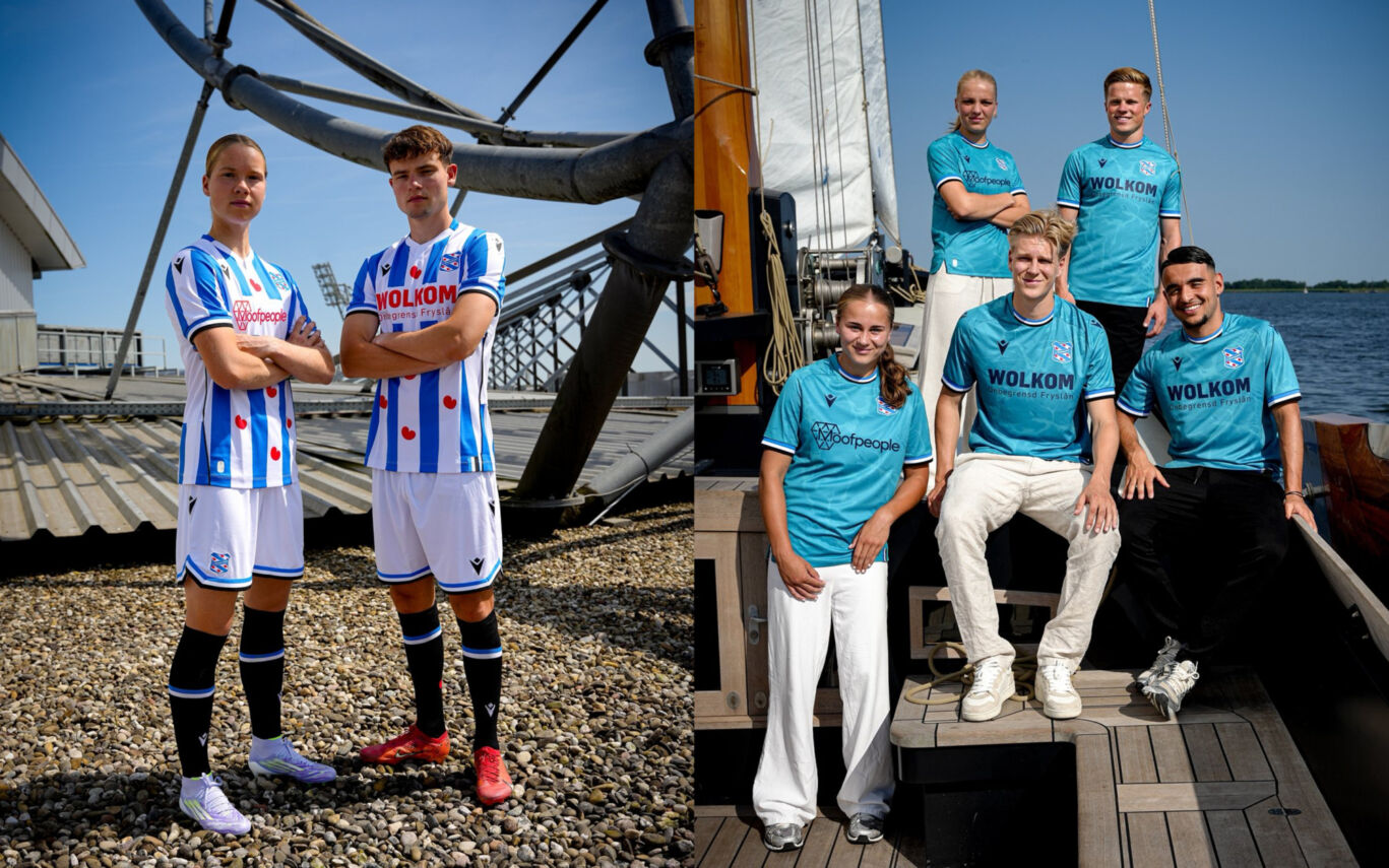
sc Heerenveen home kit 2025/26
The flag of Heerenveen served as the inspiration for this season’s home kit, with a striking blue-white-black stripe featured at the sleeve ends and echoed in a similar element on the lower right of the shirt. The black detailing also appears in the embroidered Macron logo, a subtle side stripe, and the upper back panel.
But above all, it’s the Frisian flag that takes centre stage, because ien ding feroaret noait (one thing never changes).
sc Heerenveen away kit 2025/26
Heerenveen will take to the pitch in away matches wearing a special Water Shirt: a tribute to ús provinsje (our province). Rivers, lakes, and canals are the lifeblood of Fryslân, and now also the foundation of this unique kit design. The men’s first team, women’s team, and all Academy squads will wear the shirt. A flowing water pattern runs through the fabric, because wetter ferbynt ús (water connects us). It shapes our landscape, defines our culture, and reflects how we live. The blue-white-black stripe, drawn from the Heerenveen flag, returns on the sleeves, collar, and lower right of the shirt.
Sparta Rotterdam
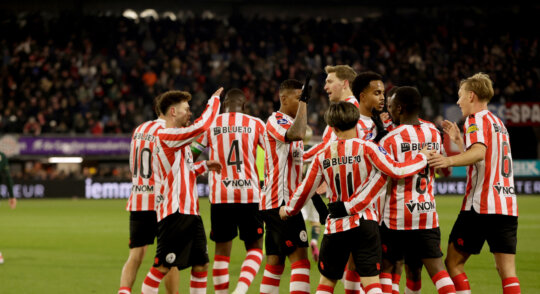
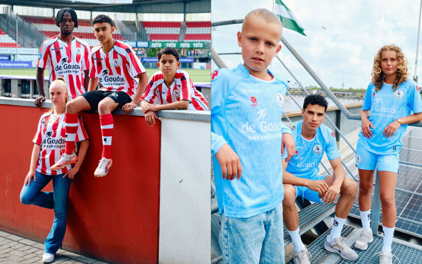
Sparta Rotterdam home kit and away kit 2025/26
Nearly 120 years ago, Willem van Hasselt created De Spartaan: a piece of art originally intended to promote a Sparta Rotterdam match on posters. What began as a simple symbol has grown into something far greater: a badge of honour, worn proudly by thousands of fans. Not just a crest, an icon. In good times and bad.
Van Hasselt, whose work is displayed in the Centre Pompidou and the Louvre, was not only a celebrated artist but also a devoted Spartan. Both he and his brother Cees van Hasselt played for the club, and his contribution to Sparta lives on through his legendary match poster design. This season, his art takes centre stage across both the home and away kits. Van Hasselt’s influence is woven into the red-and-white stripes of the home shirt, featured in the pattern of the away kit, and proudly printed on the back of the neck of both shirts. Even the home shorts carry his legacy, with his signature embroidered along the waistband.
Telstar
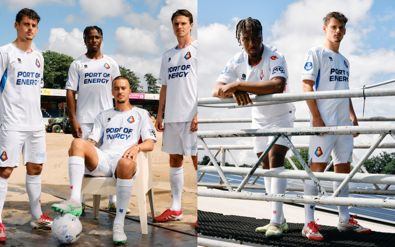
Telstar home kit 2025/26
On 17 July 1963, Telstar was founded — a club named after Telstar 1, the American communications satellite launched in 1962 that connected the world. Today, on our 62nd anniversary, we launch once again. A new home kit. A new future. A new legacy.
On the back of the shirt, a lion proudly stands. A subtle yet powerful nod to the White Lions. And the White Lions? That’s you — the fans, the players, everyone with a heart for the club. After 47 years, we return together to the Eredivisie.
Telstar away kit 2025/26
To be announced.
